Co-creating a better
testing planet
Software testing is at the heart of everything we do. Together we explore expanding possibilities on how to ship quality software products.

Latest
View All
17th April 2024
Confront and challenge the perceived hierarchy between testers and developers

10th April 2024
Test automation gets a lot of our attention, but does it get adopted as much as we think?

TLDR; After many requests, we've restarted our Slack, but this time we're doing things differently.
Upcoming Events
View All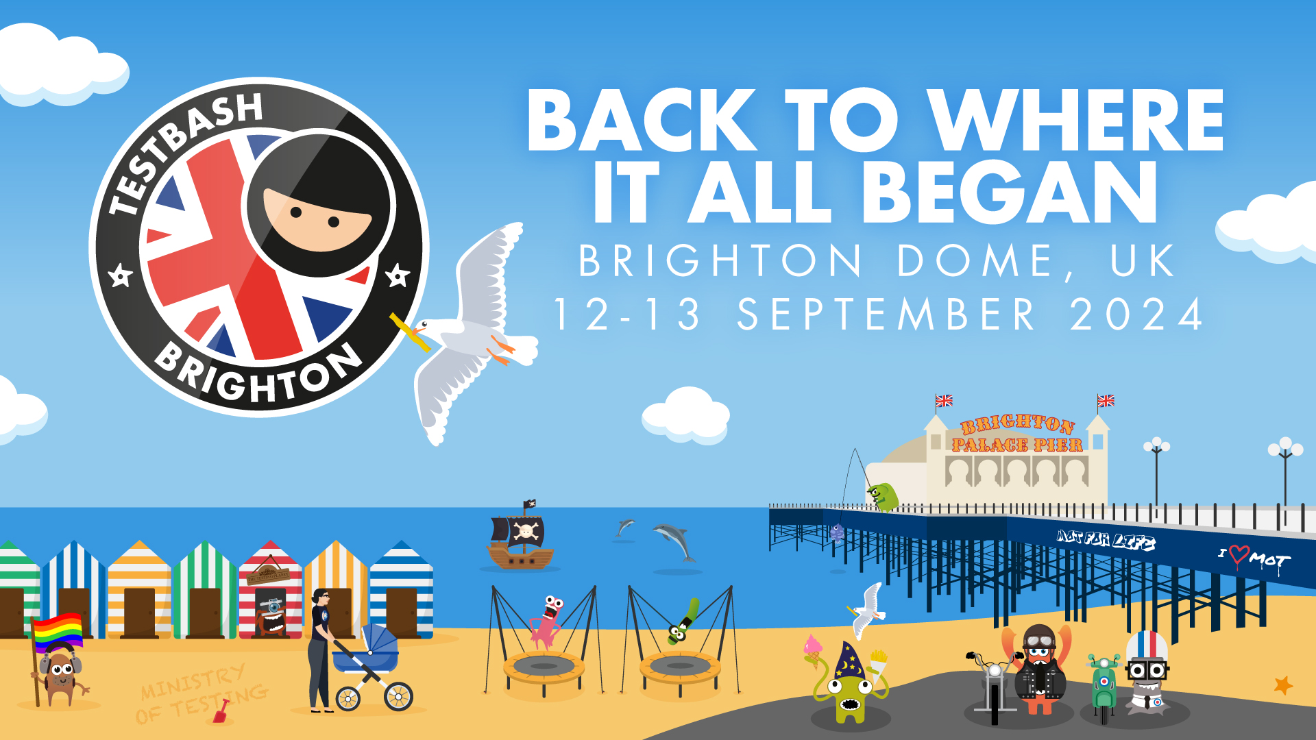
Thu, 12 Sep 2024, 9:00 AM
We’re shaking things up and bringing TestBash back to Brighton on September 12th and 13th, 2024.
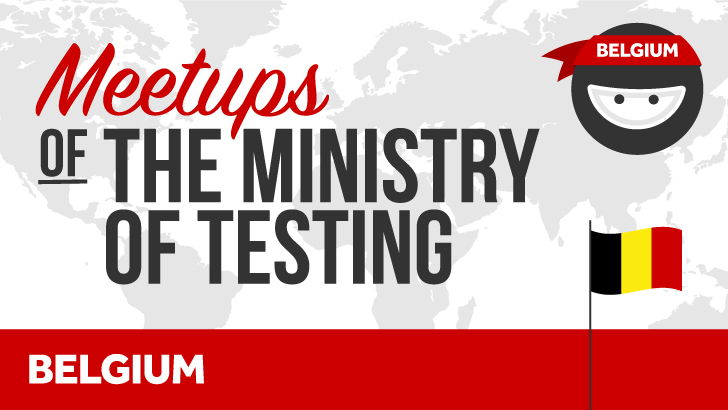
Tue, 28 May 2024, 5:00 PM
MoT is partnering up with BREWT to bring Meetups for Testers to Brussels for the years to come.

On Demand Courses
View All
Start your journey into software development and testing by learning what it's all about

Learn the Modern Testing principles that will help the whole team deliver high quality software
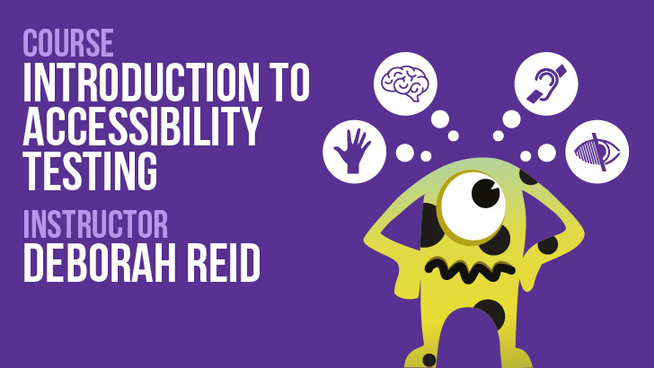
Learn with me about what Accessibility is, why it's important to test for and how to get your team started with an Accessibility testing mindset
Certifications
View All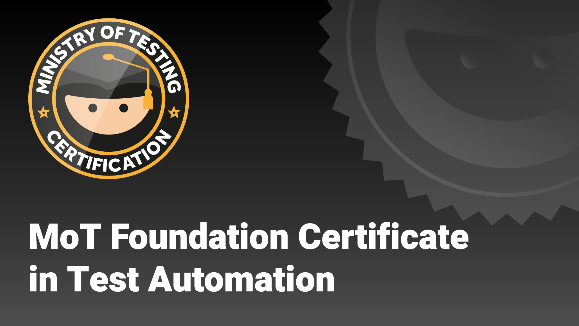
Unlock the essential skills to transition into Test Automation through interactive, community-driven learning, backed by industry expertise
Elevate to senior test automation roles with mastery in automated checks, insightful reporting, and framework maintenance

Ascend to leadership roles by mastering strategic skills in automation strategy creation, planning and execution
TestBash Sessions
View All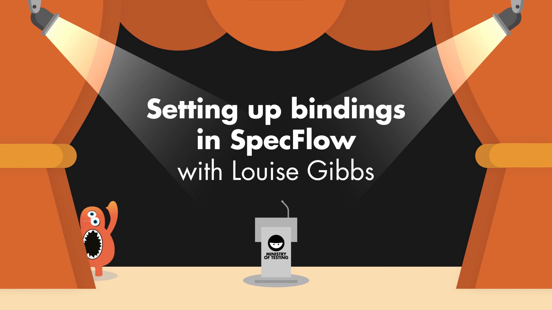
15th December 2023
Learn how to set up bindings in SpecFlow


